RIDD SORENSEN INTERVIEW
Animation Director
Saturday, September 02, 2006
BROUGHT TO YOU BY THE CHARACTER DESIGN BLOGSPOT
IF YOU WOULD LIKE TO SEE MORE CHARACTER DESIGNERS GO TO THE HOME PAGE BY CLICKING HERE
THE INTERVIEW
Tell me a little bit about yourself, about your life? Where did you go to school, and what classes did you study? What helped prepare you to become the artist that you are today?
I studied Commercial Animation at Capilano College in North Vancouver, BC. It was a very intense 2 year program that I pretty much put my all into, and it paid off as I landed a job before I graduated. It's really an amazing program - probably the best in Canada - and it's there I learned the principals and fundamentals of animation and design. My first couple of years 'on the job' though is where I learned the most about character design. I work for some very talented guys that have really schooled me on how to draw appealing, funny characters. I just need to start doing it!
How do you go about designing a character, and what goes through your mind, from start to end?
To be honest, when I sit down to design a character I don't think a lot about it. Once I have an idea I just doodle for a while on whatever paper is around until I come up with something that I think is decent enough to scan and develop further in Flash. I've never been much of a sketch artist. Not because I don't like to do it, but because I'm not very good at it! It takes too long for me to get a sketch to where I want it, and I'm rarely 100% happy with the finished result. That said, I do still sketch a lot, and I will do a lot of roughs - but when I get these roughs into the old laptop is when things start to pick up for me. Flash allows me to push my drawings a little further, change things around that aren't working, and basically get the design to where I want it.
What do you think really helps you out in designing a character?
It depends what I'm designing the character for. If it's a character for a show with an already established style, I'll look at a whack of previously designed characters and try to stay as on style as possible when designing mine. Facial expressions and body language are so important if you're trying to relay any sort of attitude or personality, so character descriptions in a script really help if they're available. If I'm coming up with my own character I tend to drown myself in a sea of reference for inspiration - real life (people watching, zoos, etc.), art books, cartoons, movies, and now bookmarked blogs. Then I'll sit down with my sketchbook and try to hammer out something half decent.
From your own experience and maybe from some people that you know, what should we put in our portfolio and what should we not?
I guess it depends on what position is being applied for, but since this is the Character Design Blog, I'll tell you what kind of stuff that really stands out to me in a designer's portfolio. Firstly, a variety of character design styles is a must. It shows that you'll to be able to pick up the style of any particular show and run with it. Try to include at least 3-4 different styles of characters. Maybe design a few characters for different shows you like as if you were hired to do it. It's important to include rough character sketches and cleaned up, finished pieces too - not necessarily colored, but it doesn't hurt.
Maybe throw in a turnaround and an expression sheet as well, because God knows you'll be doing a lot of those on the job! Including a little bit of life drawing is okay, but some people put in way too much. There's only so many freaky naked bodies I can stomach, and you can usually tell by looking at people's designs if they have an understanding of anatomy or not anyway. 2-3 solid life drawings of interesting, dynamic poses is good enough for me. Try not to include too much stuff in your portfolio. I think a solid 10 pages of the kind of stuff I wrote about above would be ideal. Just remember the phrase 'all killer no filler' and you'll be on your way! Oh yeah! DON'T include drawings in your portfolio you've copied from comics or other people's work. Usually when I get those portfolios they end up in the recycling bin!
What are some of the things that you have worked on?
I've worked on a lot of different stuff over the years for Warner Brothers, Cartoon Network, Disney, Nelvana, etc. Some of the more memorable jobs for me though were The Zeta Project, The Oblongs, Dog in a Box with 2 Wheels, Chuck Jones' Timberwolf, Rudolph and the Island of Misfit Toys, and of course Atomic Betty. I did a little in-betweening on a couple of Scooby Doo commercials which was cool. I also design t-shirts for the rock band Weezer on the side, which is a really fun gig. Haven't done any comics yet, but there's one in the works that we're starting soon!
Is there a character design you have done that you are most proud of?
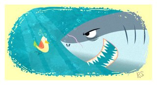
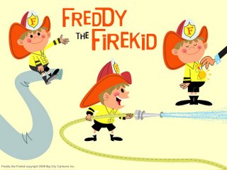
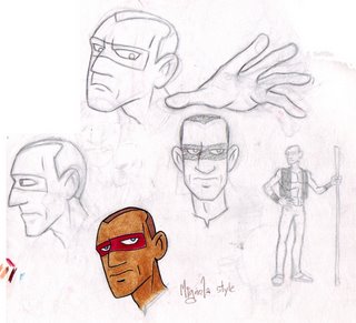
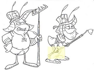
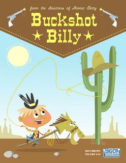
We did a storyboard test for Cartoon Network's JLA a while back, where I had the opportunity to ink the board and design a new villain they were going to introduce on the show called Deadshot. He was a blast to design because I'm a huge fan of Bruce Timm, and it was a great exercise to reference the old comic books and design him in Timm's style. Ultimately we didn't get the gig for whatever reason, but I'm really happy with what we turned in. I would have to say the characters I'm most proud of though are the ones in the shows my Big City Cartoons (http://www.bigcitycartoons.com) partner Jeff Agala (http://jeffagala.blogspot.com/) and I are currently developing - Big City Birds, Freddy the Firekid, Buckshot Billy and The Misfits.
What are you working on now? (If you can tell us)
I'm an Animation Director for Atomic Betty and a Color Stylist for Captain Flamingo here at Atomic. I'm also having fun developing new shows for Atomic and Big City.
Where is the place you would like to work if you had a choice?
Hmmmm... I think Cartoon Network could be a swell place to work at. Pixar seems like it would be a great place for a designer judging by the 'art of' books they put out. Right now however I'm exactly where I want to be, and I probably couldn't have it better anywhere else!
Who do you think are the top character designers out there?
I have a lot of favorites. Jay Ward, Hawley Pratt, Al White, Mel Crawford, Richard Scarry, Miroslav Sasek, J.P. Miller, Mary Blair, Jack Kirby and John Buscema to name a few of the old school faves. Bruce Timm, Mike Mignola, J. Scott Campbell, Shane Glines, Josh Agle, Jamie Hewlitt, Tim Biskup, D.K. Sheldon, and Terry Colon to name a few of the more current ones. I gotta say though this whole blog revolution has opened my humbled eyes to how much awesome talent is out there now! I had no idea! Check out the links section of my blog for a ton of inspirational work. There's a few there that consistently blow me away and have really given me a kick in the arse to start drawing more. Artists like Steve Lambe, Jeremiah Alcorn, Todd Kauffman, Jason Groh, Dan Thompson, Joel Trussell, Chris Battle, all my Atomic Cartoons mates, etc. etc. I could go on forever. Just start surfin' my links and you'll see what I mean. Every one of those artists has got some serious skills.
How do you go about coloring the character, what type of tools or media do you use?
Sometimes I bust out the markers and color up my crappy roughs, but mostly Flash and then Photoshop for a wee bit o' texture if needed. Love those brushes! I'd like to start painting traditionally again someday, but it's such an involved, time consuming process and I'm way too lazy.
What part of designing a character is most fun and easy, and what is most hard?
For me the hardest part is coming up with a sketch I'm satisfied with. The part I enjoy the most is bringing it into Flash and tweaking it until it's where I want it.
What are some of your favorite character designs and least favorite, which you have seen?
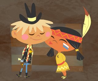
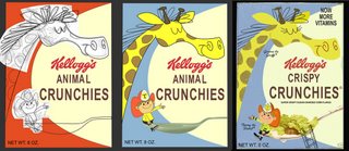
As far as what's on the tube these days, the Foster's character designers consistently blow me away with their creativity. Especially the 'other' imaginary friends you see in the backgrounds or as extras around the dinner table. I'm a huge fan of the designs on Samurai Jack and Clone Wars, too. Clone High had some consistently amazing character designs. If you take a look at my blog you can probably tell I'm a sucker for the old 50's and 60's cereal box mascots. Those, The entire Rocky & Bullwinkle cast, and most of the old UPA characters are probably my favorites.
As far as least favorite, there's a few, but I don't feel right naming them. Funny thing is these characters are on shows that are huge hits! Go figure. It seems the tides are slowly turning though and the good stuff is finally getting made. I'm totally stoked to see up and coming shows like "Gruesomestein's Monsters!" and "Camp TV". This whole blog thing is such a great thing for our industry. Maybe even it's saviour in a way...
What is your most favorite subject to draw? And why?
Hmm... right now I'm really into drawing birds for some reason. I like to draw weird, graphic shapes and turn them into birds. If you watch birds in nature they have such expressive bodies. They puff out their little chests, they sink their whole head into their body... these kinds of attributes really help when you're trying to draw personality. I get a kick out of the old vintage kid's food products too and enjoy designing mock cereal boxes from that era. I think I'm over that now though. Well, at least for a little while!
What inspired you to become an Artist?
My dad used to draw and taught me a lot of stuff when I was a kid. He also bought me the book 'How to Draw Comics the Marvel Way' when I was 11 and wrote on the front page 'go for it'. That book really got me going. I still reference it to this day!
What are some of the neat things you have learned from other artists that you have worked with or seen?
Man, so much! When I started out at Atomic, I learned a lot about character design from the bigshots that run the place. I think the most valuable thing I learned from them was how to draw funny characters. I actually have a folder full of hilarious little sketches they've done over the years that I sometimes rifle through for inspiration and a good laugh. Other tricks and treats about character design I've picked up along the way is from soaking in a ton of reference! I've spent a way too much money over the years on model sheets, books, dvds... you name it. I guess from that I've learned the importance of things like lines of action, line weight/quality, construction (shapes), and the use of facial expression and posing when conveying personality.
What wisdom could you give us, about being an Artist? Do you have any tips you could give?
There is one thing I wish I did more of when I was starting out as a designer, and something I need to do more of now. Pretending you're a character designer on a show you like, and designing a new character or posing an existing character in that style. It's really an invaluable exercise for a designer.
If people would like to contact you, how would you like to be contacted?
You can email me at ridd@bigcitycartoons.com. Also, check out http://www.bigcitycartoons.com too if you get a chance. I promise we'll update soon!
Finally, do you have any of your art work for sale (sketchbook, prints, or anything) for people that like your work can know where and when to buy it?
Not yet, but I'm working on it! We're going to do a studio sketchbook soon, and there's going to be an online store where you can buy t-shirts and other cool stuff on the Big City Cartoons website. I really want to do a couple of children's books someday too. Keep checking the blog for more info!
Subscribe to:
Posts (Atom)

